Once I decided to start taking more steps toward the writing career I felt called into, I thought it would be cool to have my own logo!
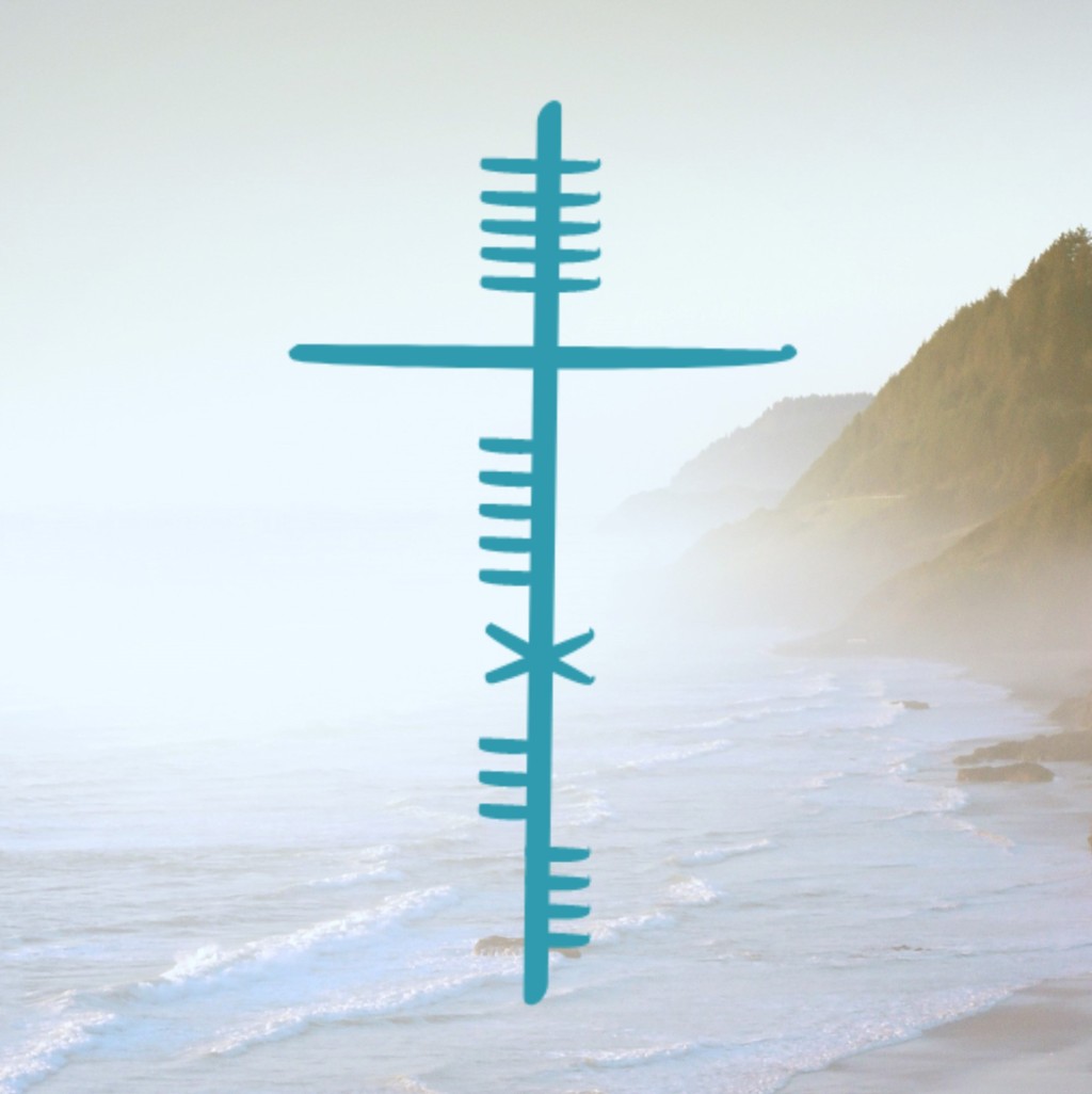
I wanted my logo to point to God. But I also wanted it to reflect, well… me and my own uniqueness. I really like learning about my Celtic heritage, and I learned that in ancient Ireland, people used a writing system called Ogham. It uses long lines with little notches carved into them, and each group of notches represents a letter. Traditionally, Ogham is read vertically from bottom to top, unlike this post! I became fascinated by this—that’s when an idea hit me to use it for a logo.
But then I started to question whether that idea was good or not. After all, the more I researched Ogham, the more I found that it has made its way deep into very pagan traditions. Ogham symbols are commonly used today to represent various kinds of trees, because the Celtic pagans believed they could communicate with the trees spiritually. Therefore, the Ogham alphabet is used as a tool for divination; those who know God know He forbids that. It’s just one other way people glorify creation instead of its Creator. If Ogham is used for pagan practices, how could it possibly glorify God? I thought.
I realized, after talking to God about it a bit, that I was overthinking (like I always do). Are Ogham symbols used for divination? Of course. But does that mean Ogham is inherently evil? Well, no. It’s no more evil than the English you’re reading right now. It’s simply a writing system that people used long ago to communicate, and any language can be used for evil, including modern English. This inversely implies that any language in the world can also be used for good. So why not use the Ogham writing system to point to the Creator rather than creation for a change?
I was so excited and got right to work. I had it finished in mere days. At first glance, the logo just looks like a simple cross with random lines on it. But now you know it’s not just a cross—it’s actually an Ogham word!
What you’re seeing is the Irish word “cneasaí” (pronounced “k-nah-see”), which means “healer.” This was the perfect word for me to use because not only is God the Healer, He’s my Healer! I feel like a major theme of the past year of my life was healing, as I healed from a huge heartbreak and from mental and spiritual health battles. I would still be hopeless and hurt if I didn’t know He was really there with me and would make all things right in the end. Even my name points to it—my middle name is Raffaela, after my great-grandma, who went by the nickname “Rae.” “Raffaela” is the Italian, feminine form of the Jewish name “Raphael,” which means “God has healed.” All of that is why I chose the pen name Calla Rae.
On the vertical line in the logo, every series of notches represents a letter in the word “cneasaí.” The second to last letter (A) in the word is one single notch near the top of the line. I realized that if I simply elongated it more than the rest, it would form the shape of a Christian cross. There is no greater symbol or logo for healing—for on His cross, Jesus healed all who follow Him from their sin.
But he was pierced for our transgressions,
Isaiah 53:5, NIV
he was crushed for our iniquities;
the punishment that brought us peace was on him,
and by his wounds we are healed.
It’s perfect—almost like it was planned out for me.
